Exploring COVID-19 Vaccine Effectiveness
This project is an exploratory data analysis (EDA) of COVID-19 vaccine effectiveness compiled by a group of aspiring data scientists at The Roux Institute. The team decided to examine commonly used COVID-19 information sources (Center For Disease Control and Prevention and Johns Hopkins University) and visualize the relationship between Covid-19 vaccinations and deaths the United States between 5/31/21 - 11/30/21.
For more information about the data (including the data processing/cleaning preformed for this project), please visit the project repository.
National View
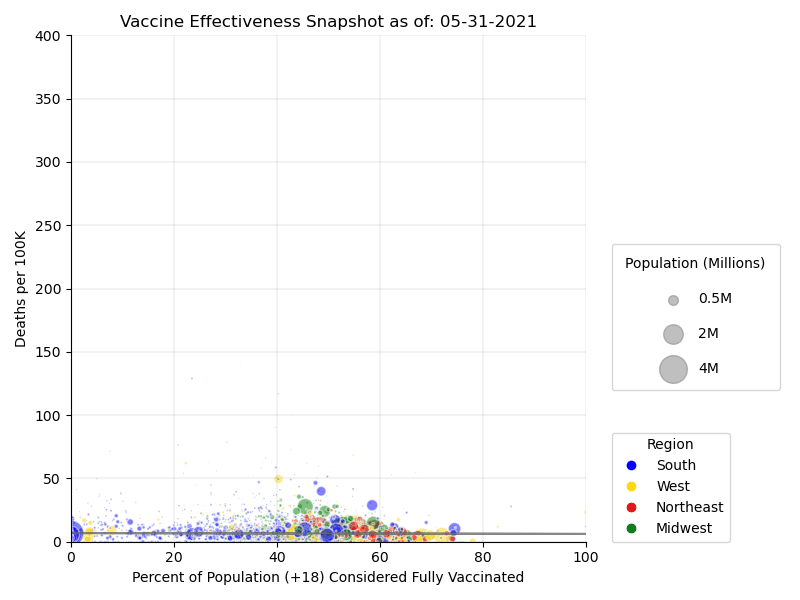
Methodology
To assess the effectiveness of the vaccination over time, the % of the vaccinated population over 18 years of age (CDC) is compared to Covid related deaths per 100k (JHU). The data was broken down by U.S. region (West, Midwest, South, Northeast) based on the Center For Census Bureau regional divisions, and a snapshot was of data was taken at the of each month to create a more accurate representation. Because the JHU cumulates deaths, the time series was adjusted to compute the difference in death figures between dates.
County View
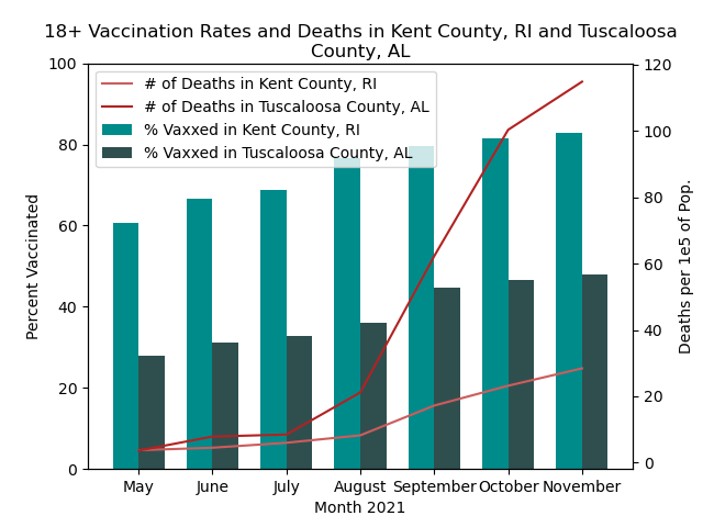
Methodology
Similar to the National View, this analysis is comparing the number of deaths and vaccination percentages over the same time period. However, the visualization shows a county-level comparison between Kent County, RI and Tuscaloosa County, AL.
The team selected Kent County and Tuscaloosa County due to their similar population demographics, but highly different rates of vaccination to see the impact (if any) on death rates due to COVID-19. The same JHU and CDC data sources were used.
Analysis
National View
The proportion of the population that is vaccinated increases over the time frame, which you can see as the bubbles move from left to right. The quantity of deaths increases as well month-by-month, which makes sense: more deaths accumulate each month while the denominator (the 2019 Census population) stays the same. We also know that the Delta variant hit during this time period, which was much more contagious than previous strains: we should expect deaths to increase.
However, consider the trajectories of the large bubbles (representing highly populous counties) vs. their smaller counterparts. The largest bubbles progress steadily into the 70-80% vaccinated range by the end of the timeframe, and their rate of deaths generally tops out at 100 deaths/100K people. Many smaller bubbles struggle to reach the 50% vaccinated mark, and several of their death rates soar into the 300-400 deaths/100K range. Comparing these two groups suggest that vaccination is highly effective–otherwise the more highly-populated areas would likely have similar (or even worse) death rates, given the physical proximity of the population in these urban centers.
Regional differences prove to be fertile ground for continued research. Many of the small blue dots, representing counties in the South, don’t reach the 50% vaccinated threshold. However, the large blue bubbles (representing urban areas in the South) follow a more direct left-to-right trajectory–and tellingly, keep their death rates low.
These findings suggest that behavioral differences in rural vs. urban communities (mask wearing, social distancing, etc.) or differences in political ideology may affect vaccine adoption–but they offer little doubt that the COVID vaccines are effective at minimizing the death toll of the virus.
County View
The visualization indicates a very noticeable difference between the number of deaths in a county with high vaccination rates (Kent, RI) and the number of deaths in a county with low vaccination rates (Tuscaloosa, AL). It is important to note that this analysis only compares two specific counties and does not take into consideration other relevant factors such as mask wearing and social distancing. However, it is still interesting to see that the conclusion from the analysis of all U.S. counties is the same as the analysis from individual county perspective.
Acknowledgements
For more information about the contributors of this project, please visit the project repository.
The inspiration to visualize vaccine rate v death rate for this project came from the following NPR article: Pro-Trump counties now have far higher COVID death rates. Misinformation is to blame.