COVID-19 Vaccine Effectiveness
This site displays the updates to a repository originally constructed by the DS5010 Spring 2022 class and updated once by the DS5010 Fall 2022 class before being updated by the current DS5010 Spring 2023 class. The original data analysis and data framework was created by combining information from common COVID-19 data sources (Center For Disease Control and Prevention and Johns Hopkins University). This was used to visualize the relationship between Covid-19 vaccinations and deaths the United States between 5/31/21 - 1/24/2023.
For more information about the original repository and its data (including the data processing/cleaning performed), please visit the original project repository.
For more insight into the updated repository and changes to its data, please visit the updated project repository.
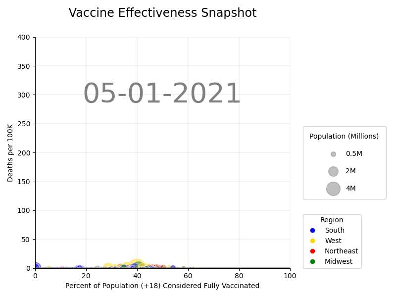
National View
Methodology
To assess the effectiveness of the vaccination over time, the % of the vaccinated population over 18 years of age (CDC) was compared to Covid related deaths per 100k (JHU). The data was broken down by U.S. region (West, Midwest, South, Northeast) based on the Center For Census Bureau regional divisions, and a snapshot was of data was taken at the end of each month to create a more accurate representation. Because the JHU cumulates deaths, the time series was adjusted to compute the difference in death figures between dates.
Due to changes in reporting measures, starting in June 2022, rather than reflecting the last day of the month, the data reflects the last Wednesday of the month.
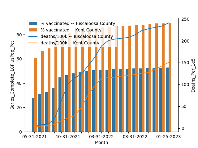
County View
Methodology
Similarly to the National View, this analysis is comparing the number of deaths and vaccination percentages over the same time period. However, the visualization shows a county-level comparison between Kent County, RI and Tuscaloosa County, AL.
The original team selected Kent County and Tuscaloosa County due to their similar population demographics, but highly different rates of vaccination to see the impact (if any) on death rates due to COVID-19. The same JHU and CDC data sources were used.
Contextual Analysis
Further research explains some of the trends we can see in the above charts.
When reviewing the National View, we believe that the large shift in vaccination rates seen throughout the country in the summer of 2021 can be explained by vaccines only becoming publicly available in May of 2021. We also believe that the spikes in deaths shown in both the National and County view in the fall of 2021 are a result of the delta variant.
On the other hand, it appears that smaller localities tend to have the highest rates of deaths per 100k, a disparity which grows more prominent as time passes, even if or even as vaccination rates have increased. Other research corroborates that rural residents are normally more vulnerable to death from COVID-19 due to factors that include underlying health conditions, older age, and lack of health insurance.
As for the County View, we were able to look back at public records and theorize that the confounding variable of political alignment for Rhode Island and Alabama (with the prevailing theory that Democrat-run states took a more cautious/careful approach to Covid compared to Republican-run states) had little to no effect. We are able to say this because while Alabama did remove their stay at home order first (with their “safer at home policy” being discontinued in late March 2021), Rhode Island was not far behind with their high risk Covid activities being allowed again in July 2021.
Additionally, it is evident that there is a flattening out of the deaths per 100k in both locations, starting in about March 2022. Some of this is likely attributable to the completion of a 'winter spike', but it is also possible that the spread of the omicron BA.2 subvariant, which became the dominant strain in the US around that time, had its part to play. After all, omicron and its subvariants, while more transmissible, normally caused less severe illness and would therefore contribute to fewer deaths as compared to delta, the prior variant of concern.
Repository Changes
The major changes used to update the visualizations came from expanding the timeframe to stretch beyond the original six months used by the Spring 2022 DS5010 class and come to current day, which means that the visualizations span the timeframe of May 2021 to January 2023. In the process of updating the timeframe, we also made changes to the visualization, by mapping the comparison with seaborn rather than with matplotlib and by ensuring that the gif was in chronological order.
We also updated this webpage and README.md to account for the changes that we've made.
However, the Spring 2023 DS5010 class made additional changes, including reduced hard-coding, code simplification, and deleting some extra files. We also added a .yml file and addressed compatibility issues caused by updates to packages, although a fuller history of what we identified and addressed as issues can be found at the vaccines-3 issue log.
Acknowledgements
For more information about the original project, please visit the project repository.
The following article was referenced when hypothesizing about changes in vaccination rates: Fact Sheet: President Biden to Announce All Americans to be Eligible for Vaccinations by May 1, Puts the Nation on a Path to Get Closer to Normal by July 4th.
The following article was referenced when hypothesizing about the delta variant and vaccination rates: Coronavirus News - August 2021.
The following article was referenced when hypothesizing about the impact of the delta variant: Increased risk of hospitalisation and death with the delta variant in the USA.
The following article was referenced when hypothesizing about vaccine effectiveness and death rates: Rural Residents Appear to be More Vulnerable to Serious Infection or Death From Coronavirus COVID-19.
The following article was referenced when hypothesizing about differences (or lack thereof) between the two compared counties: Governor McKee, Rhode Island Department of Health Lift COVID-19 Restrictions on Remaining "Higher Risk" Activities.
The following article was referenced when hypothesizing about differences (or lack thereof) between the two compared counties: COVID-19 County Resources and Updates.
The following article was referenced when hypothesizing about the flattening of the death curve when comparing the two counties: More contagious omicron BA.2 subvariant now dominant in the U.S., CDC says.
The inspiration to visualize vaccine rate v death rate for this project came from the following NPR article: Pro-Trump counties now have far higher COVID death rates. Misinformation is to blame.